
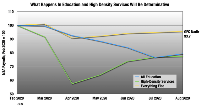
 Almost to the Bottom
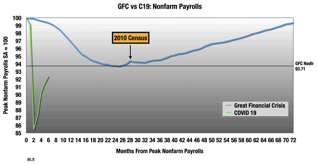
I find it helpful to compare everything to the Great Financial Crisis. Most everyone reading this remembers it well, and until now it was the worst economic disaster of our lives. As far as jobs are concerned, we still have a little ways to go to get back to the worst of 2008-2010. As you can see, temporary workers on the 2010 Census helped turn it around a bit, but we are about to lose that 2020 boost, 288,204 jobs on the week of the jobs surveys.
But that green line is hiding a wide disparity across industries and sectors. What we saw in June and July consumption was that services remained terrible, but goods industries were actually above February levels. Many of the services people purchase are closed or unsafe, so they have taken the brunt of the storm.
But people are also stuck in their homes and bored, and seeing every flaw their home has every waking moment. So, they have taken the large savings from all those services not purchased and put it into their homes – new furniture, appliances, electronics, building materials and garden supplies. And, of course, more food and household supplies to substitute for all the meals not eaten out in the past 5 months.
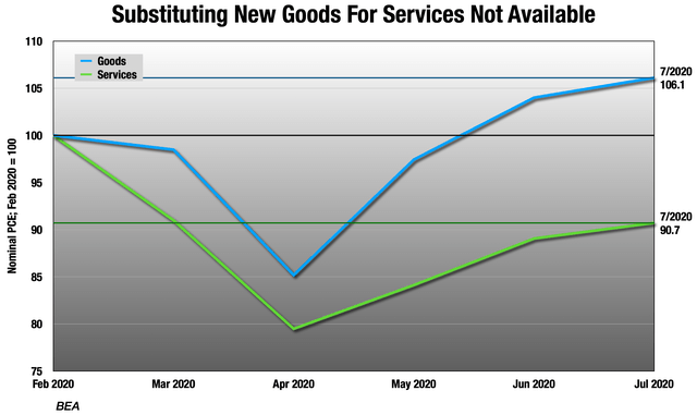
Since the rest of the economy follows consumption patterns, the employment situation looks pretty similar.
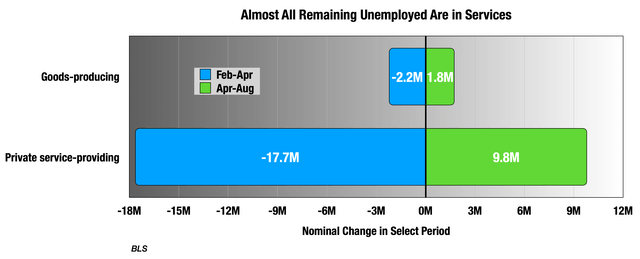
 But the problem is this:
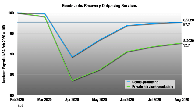
 So the job losses in goods industries were much smaller to begin with, and almost all the remaining lost jobs are in services. Only about half a million lost goods-producing jobs remain.
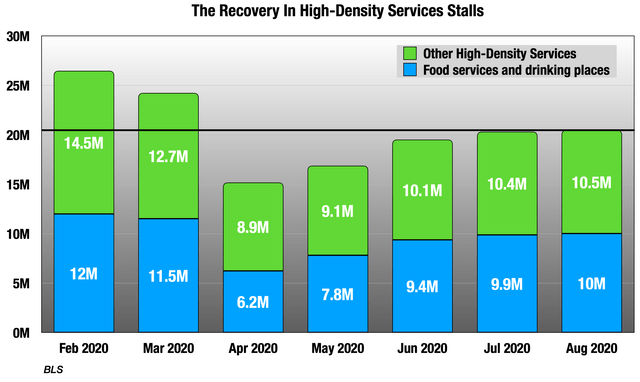
 In the July consumption numbers, we saw a group of high density services that was at the core of the problem. These are businesses with high fixed costs that make up for it with density and volume at peak demand times – transportation, leisure, accommodations, restaurants and bars, entertainment, personal care, and residential medical. These were 23% of consumption in 2019, but only 18% in July.
Looking at these businesses in the employers’ survey, these were 18% of all jobs in February and only 15% in August, though that is back up from 12% in April. There are still 6 million lost jobs in these categories, 57% of all remaining lost jobs. 2.5 million are just restaurant jobs.
 As you can see, the last two months were pretty flat here.
But there are also 3.1 million education workers wondering if their jobs are coming back this fall.
 The blue and green lines were 35% of all jobs in February, but 33% in August.
So like in other parts of the economy, we are seeing a wide divergence between those parts of the economy centered around goods, which are recovering well, and the much larger services industries which are not.
Why NSA?
Unlike most analysts, I have been mostly using the not seasonally adjusted numbers since this all started. Why?
Under normal circumstances, the adjustments are important, because without them, every January and July would look like recessions.
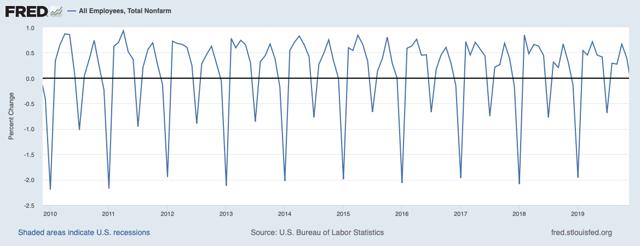 I pulled out the recent action so you can see what a more normal 10-year period of NSA payrolls looks like.
But never has seasonality been less relevant. The adjustments are multiplicative, not additive, so they can be very large when we are dealing with large changes like we are now. BLS has shifted the unemployment insurance adjustments to additive starting with last Thursday’s, but the jobs adjustments remain multiplicative, and they are over-adjusting.
But most importantly, I want the answer to the question, “How many Americans were employed in mid-August?” The not seasonally adjusted numbers answer that question, or at least try to.
But it is summer and the unadjusted numbers are highly affected by the education categories:
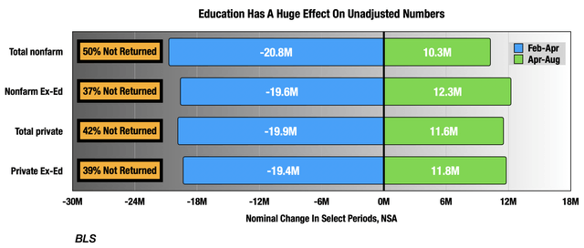 We will look at education last, since this is a special case.
Problem for a later date: the seasonal adjustments are based off previous years’ NSA numbers. They are going to have to come up with some way of adjusting the adjustments for all the highly unusual data coming through in 2020. If they don’t, Q2 2021 will look like the greatest economic miracle of all time, only to be crushed hard in Q3 and Q4.
The Household Survey Remains a Mess
Since this all started, the data quality has been exceptionally poor, and this has nowhere been more evident than in the BLS current population survey, a.k.a., the household survey. The survey is conducted by the Census Bureau, which is in the Commerce Department not Labor like BLS, because they are the agency charged with asking people questions.
The survey is conducted during the week ending Saturday that contains the 12th of the month. They try and reach each household in the survey for 8 months in a row, and typically, they get responses from over 80% each month. The first and fifth are in-person interviews, the rest phone interviews. That first one is crucial.
The biggest problem they are having is that they are not doing in-person interviews, and as a result they are having lots of trouble getting households onboarded into the process. Here are the participation rates for August broken down by month that household is in the survey, compared with the February TTM average:
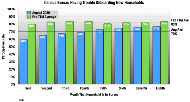 As you can see, they’re having particular trouble with that first few months, going back to households that began the survey in May. The first month response rates were even lower then.
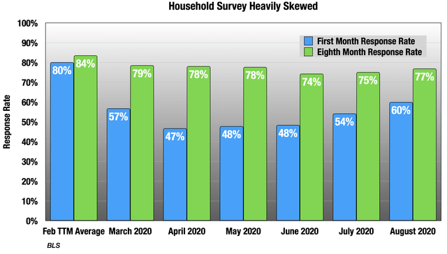 So now the survey is heavily skewed to households that onboarded in January through April. There is no telling how this sort of large sampling error affects the results, but it throws all the assumptions that undergird survey research out the window.
As an undergraduate, I was a phone interviewer on two regular academic surveys, one monthly and one quadrennial. There are typically three reasons why people don’t respond to phone interviews:
- Not available when calling. This was a much bigger problem before mobile.
- Not comfortable answering questions. In contrast, this is a bigger problem now.
- The interviewee has bad news to share, and just isn’t in the mood.
Over time, surveyors have learned how to adjust for those first two, but the third is more difficult to deal with. I think we are probably seeing a combination of 2 and 3 in these low response rates. The first in-person interview is a crucial part of getting the ball rolling in each household, and getting them comfortable with the process. But also, there’s a lot of bad news out there right now. Again, there is no telling how this is changing the results.
The other big methodological issue has been coding error by the Census interviewers. Since it’s now under 1 pp of unemployment rate, I won’t go into the gruesome details, but it’s kind of amazing that I’m still talking about it now half a year later.
But there is one thing we would all like to know: what is the unemployment rate? Heck, if I know.
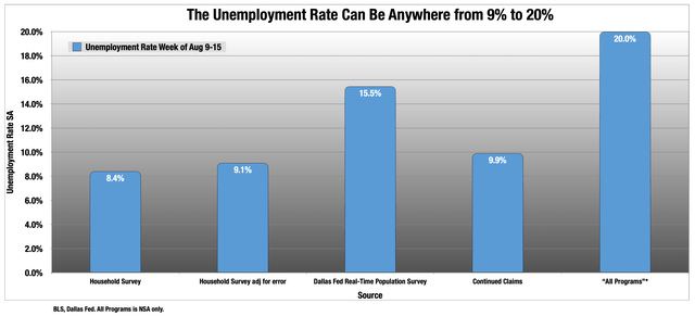 Can you feel my frustration when I made this chart? So let’s break it down. The household survey top line adjusted number was 8.4%. But there is 0.7 pp of Census coding error, taking it up to 9.1%.
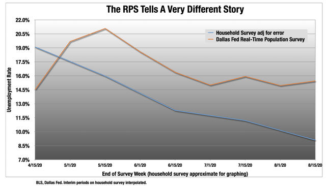
The third column is a survey designed by economists at Arizona State and Virginia Commonwealth and adopted by the Dallas Fed. It essentially strips the household survey down to its bare bones, so it is a much shorter survey with limited data, but conducted twice monthly. It has been pretty flat since the July 1 survey, and is now much higher than the household survey, even adjusted for Census’ error.
 The final two columns in the previous chart are both from Thursday’s unemployment insurance (UI) report. This is normally one of the most reliable data sets, as state governments are party to every single transaction. We get a very reliable weekly number with one set of typically small revisions.
But nothing is normal now. State unemployment departments and their ancient IT infrastructure are straining under the unprecedented load, and revisions have been larger than usual. On top of that, Congress has added new programs for them to administer, the largest of which is the Pandemic Unemployment Assistance (PUA). These are not being listed with the regular state UI programs, but separately at the bottom of the report in the “All Programs” table. The difference between continuing UI claims has been very large.
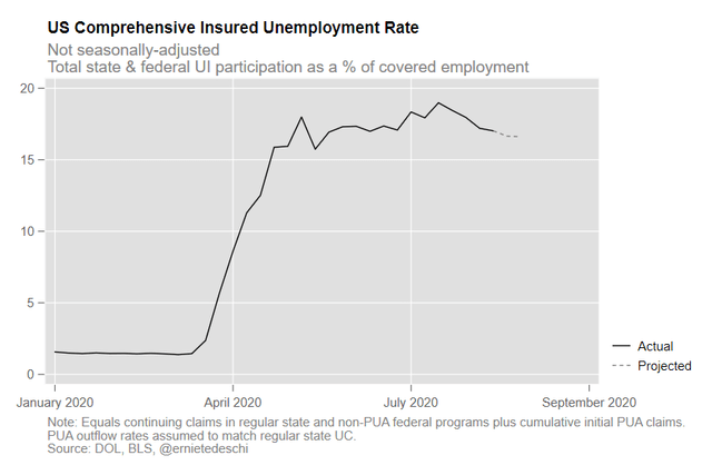
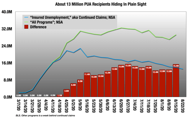 So there are currently over 15 million recipients, about 13 million from PUA, who don’t get counted in continued claims. As you can see, the All Programs number has remained very sticky around 30 million. Some of these overlap with continued claims so are double-counted, but most do not. Economist Ernie Tedeschi tried to disentangle that, and came up with an unemployment rate of around 17% for the week of the household survey.
 So back to the question: what is the unemployment rate? I can tell you it’s not 8.6% or 9.1%, and that it is likely much higher. Beyond that, look at the charts above and take a wild guess. Yours is as good as anyone else’s at this point.
We can’t trust the top line number, which means we also can’t trust the very important other parts of the survey that tell us about labor force dropouts, temporary versus permanent layoffs, and other very important forward indicators. This is very unfortunate, but I won’t waste our time.
The Employer Survey
So we are left with the employer survey, which looks at the situation from the other side of the coin. The response rates are back to normal here, though they are leaning more heavily than before on internet surveys as opposed to phone interviews, and that’s always a methodological concern.
Because they interview employers, there are important differences with the household survey.
- As the name “nonfarm payrolls” implies, the employer survey does not include agricultural jobs. The household survey put these at 1.4 million in August.
- It also does not include unincorporated self-employed (9.6M in household), unpaid family workers (91k in household), or private household workers (715k in household), which are all included in the household survey.
- The household survey is limited to workers 16 and over, while the employer survey is not. There’s no way of knowing what the under-16 number is.
- The employer survey overcounts multiple jobs holders. The household survey put this at 6.5 million in August.
So it’s measuring different things, and what it is good for is separating out industries and payroll. So let’s get to it.
Goods-Producing
We already looked at the dichotomy between goods and services, and we will see it is not all good news here. In the first place, goods consumption is outpacing employment in those industries. Consumption was up 6% from February levels in July, but goods-producing jobs were still down a little over 2%. So employment is responding to the demand, but not entirely yet.
Starting with manufacturing:
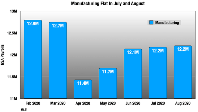 After seeing July consumption, I was expecting a big boost here for August, but as you see it’s been pretty flat since June. The consumption surge was concentrated in household goods, and so too was the hiring.
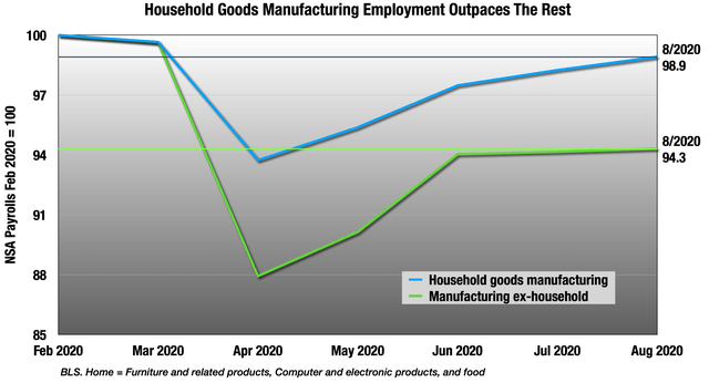 But the problem here is that green line represents many more jobs.
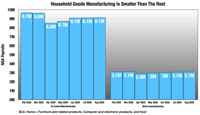 So overall, the net is pretty flat in July and August. There has been the usual talk of skills gap, but it is really not showing up in wage data, or in employment services.
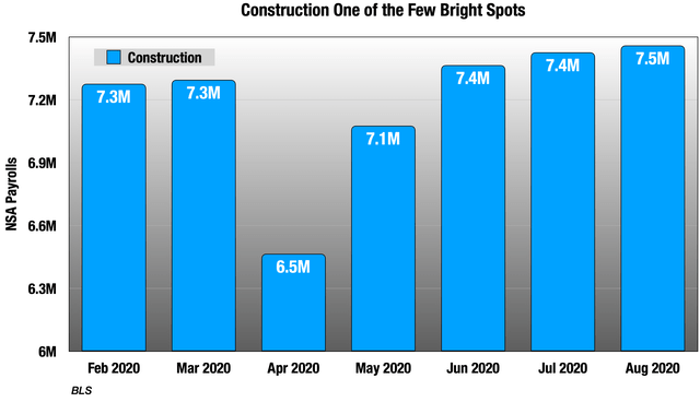
Moving on to construction, this is one of the only places we will see this:
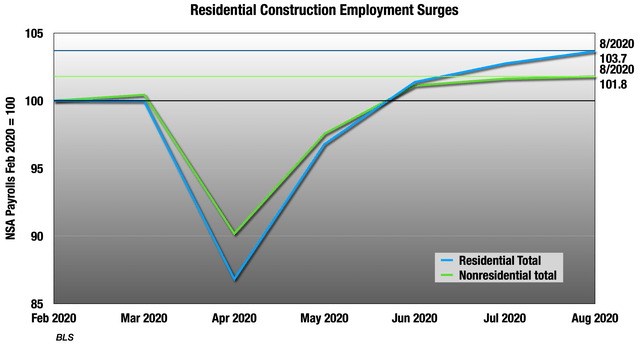
 Both sub-categories are doing better than February, but nonresidential more so:
 Construction is very seasonal, mostly owing to the civil and heavy engineering construction subcategory, and in the seasonal numbers, employment is down in all the categories. But as we discussed, the seasonal adjustments are over-adjusting right now, so it’s hard to say where exactly we stand. But regardless, construction remains the best employment sector right now.
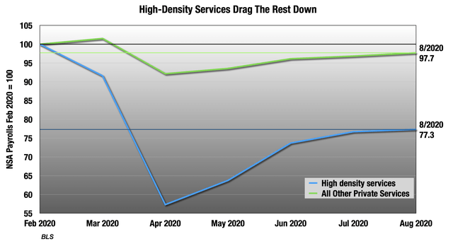
High-Density Services
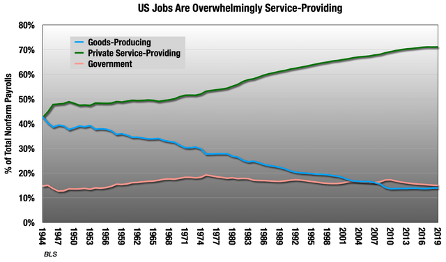
Outside of clothing and gas, services is where we saw all the problems in July consumption, and that’s being reflected in employment. Remember that private services were 71% of jobs in 2019, so it is the largest part of employment to begin with.
Looking at where all the remaining lost jobs are:
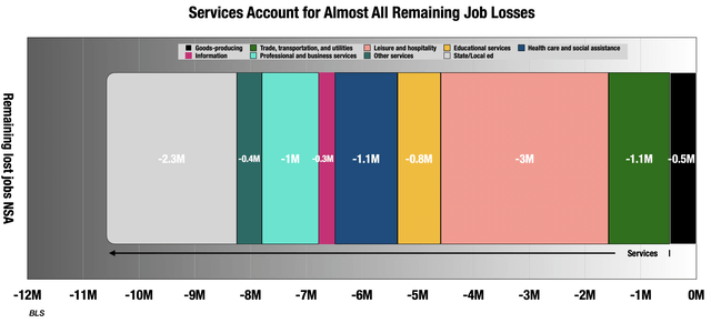 Everything we discussed in the last section is all in that black box to the far right. We’ll get to public education, the gray box on the far left in a moment, but let’s start with the biggest problems, which are the high-density services we discussed in the intro. These were 18% of jobs in 2019, but only 15% in August, accounting for 57% of remaining lost jobs.
 Food services job losses are a third of this group:
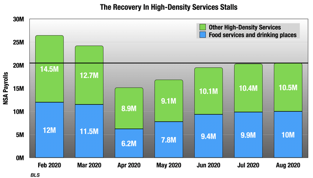 Food services in total has 2 million remaining lost jobs alone, accounting for 24% of the total. Digging even deeper, exactly as we saw in consumption, fast food is doing much better than the rest:
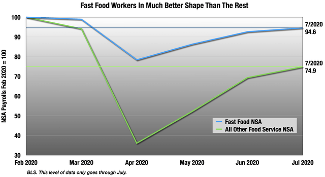 But even for fast food, employment was still down 5% from February through July, even though consumption was up in that period. Employers may not be entirely buying this surge.
The next two biggest problematic areas are arts, entertainment and recreation, and accommodations. Together they account for about 10% of remaining lost jobs, with a little more coming from accommodations. Both are still down over 20%, and pretty flat in August.
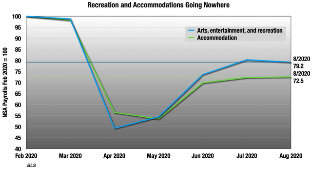
Accommodations is largely hotels, but even campgrounds and RV parks are down in the seasonals, though up quite a bit in the unadjusted numbers.
In arts and entertainment, it is very flat:
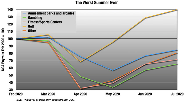
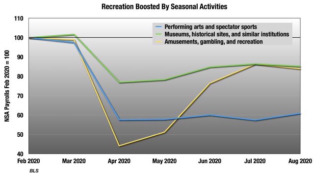 But the yellow recreation line is being boosted by highly seasonal categories like golf courses, but even that is way down in the over-adjusted seasonals. This was the worst summer ever for all these businesses that should be surging in these months.
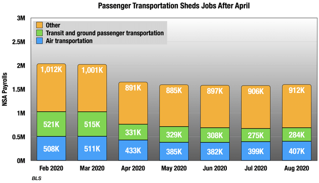
 Next is passenger transportation, about 4% of remaining lost jobs. This is one of the few places that has shed more jobs since April, and the September numbers will probably be worse from airline layoffs.
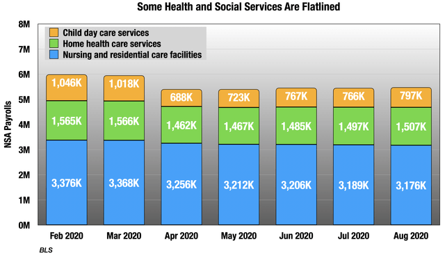
 Next is three health care and social assistance sub-categories: residential health care, home health care and child care. Together, these represent over 6% of remaining lost jobs, and are pretty flat since April. Residential medical continues to very slowly shed jobs every month.
 I’m going to group the final two categories together just for convenience.
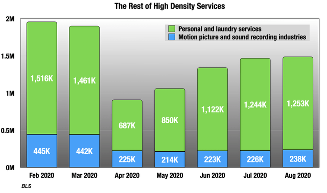 Most of that green box is personal care, and you can see it was one of the hardest-hit categories in April. It is still down 17% and pretty flat in August. 2.5% of remaining lost jobs are there.
The blue box is a very small category as you see, but it is still the source of 2% of the remaining job losses. Movie production and theaters are in there, and they have been particularly hard-hit.
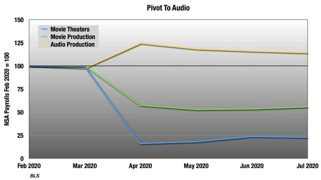 Seeing unadjusted movie theater employment drop from June to July is not normal. As you see, there has also been increased demand for audio production to fill in some of the media landscape gaps.
Retail
About 10% of jobs are in retail, so this is always an important sector. From the top level, it’s not bad, only down 3% in August versus 15% in April, which is a nice recovery. But there are two groups going in opposite directions. On one side is groceries, home and garden stores, and general merchandise, which includes warehouse stores:
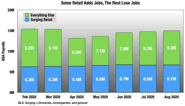 So the group in green is up 7%, and the rest is still down 9%, though that was much more in April.
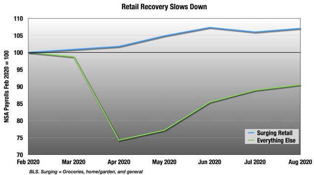 But as you see, both of those lines are flattening out. Let’s start with the surging group.
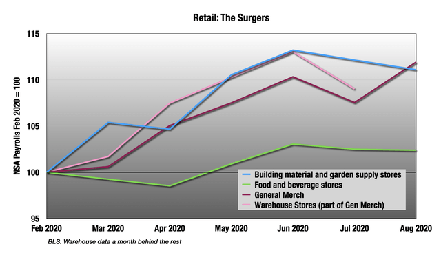 The big hiring is coming at warehouse stores and home/garden stores. They are well above February levels.
But the rest is still floundering, though well off April lows.
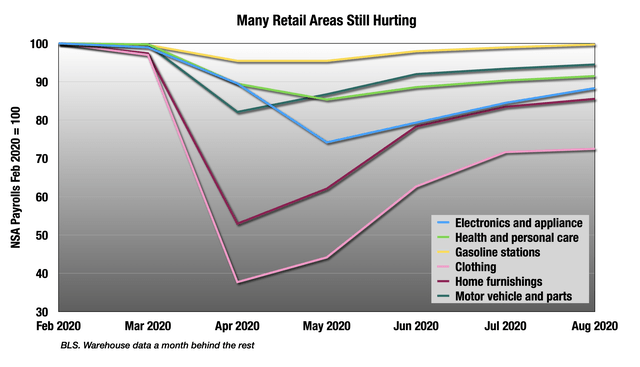 Only gas stations, never that bad in the first place, are close to zero. The rest are still really struggling, and mostly headed sideways.
But the most remarkable thing in retail is this:
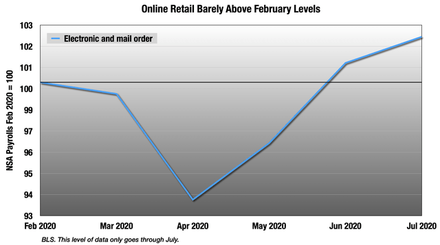 Online retail employment is only up 2.4% through July. I would have expected a lot more.
Health Care
Health care is another giant sector with 11% of all jobs. This was one of the places where I was pretty confident in a recovery. In contrast with manufacturing, hiring in health care is better than what we are seeing in the consumption numbers, which are surprisingly limp still.
The entire category is down 4% after being down 9% in April, and is home to 6% of remaining lost jobs.
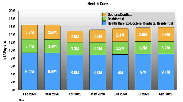
We already discussed the slow slide of residential medical, but the other two groups in there are behaving very differently.
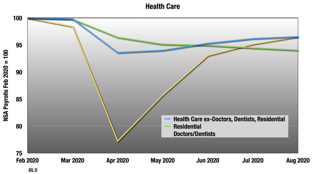 Doctor/dentist office has one of the sharpest declines in employment in April, but jumped back quickly. The recovery slowed in both July and August, and those jobs are still down 3.5%. The blue line is mostly hospitals, and that’s sort of drifting sideways, still down 3.4%.
Professional and Business Services
This is one of the most troubling areas to me, because many of these jobs can be done remotely and are still gone. It is home to 10% of all remaining lost jobs, and is still down 5% in August. Over half those remaining lost jobs are just in accounting firms and employment services.
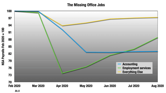 Employment services are getting better, but are still almost 4% of all remaining lost jobs, just in that category. The rest is just a straight line across, with accounting firm employment still down 17% from February.
Education
Along with restaurants this is the largest area of missing jobs right now in the NSA numbers at 3.1 million when we add up public and private education services, 30% of remaining lost jobs. But of course it is summer and education is highly seasonal this time of year.
The point of seasonal adjustments is to say, “Yes, all the teachers are not teaching right now, but they will be back in the fall.” This year, we really don’t know. If we look at the seasonals and unadjusted together, we see there was very little August turnaround in this important sector:
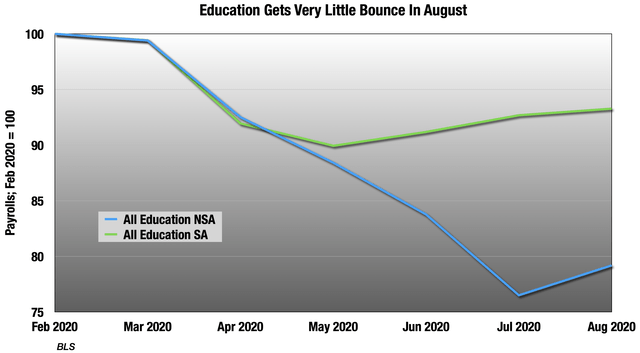 Even in the adjusted numbers, there are still 1 million jobs missing. Remember that not everyone in educational services is a teacher. There are administrators, staff and facilities support. Whether it’s in-person or online, someone has to teach. But the rest are only necessary if the kids are in the classroom. The report does not break out teachers from the rest, so it’s difficult to know.
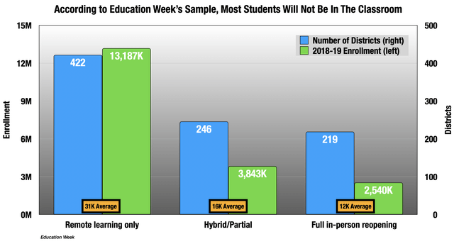
Education Week is trying to keep track of public school opening plans this year. Their database has 888 districts with combined enrollment in 2018-2019 of almost 20 million students. There are 13,000 school districts in the US with a total of about 50 million students, so this is not a full census and is heavily skewed towards larger districts. But in that sample, only 18% of the districts with 14% of the students had opened by the time the BLS surveys ended.
The bottom line is that we will not know how this is going to play out until September and October, but the August numbers are not encouraging.
Keep in mind, this is heavily skewed, but Education Week’s database says most students will not be in the classroom, and that larger districts are more likely to opt for distance learning.
 Summary Bullets
- The household survey is an absolute mess. Low response rates and coding errors have made the numbers from it highly unreliable.
- The unemployment rate is certainly higher than 8.4%. By how much is anyone’s guess. The range of possibilities is between 9% and 20%.
- Like we saw in the July consumption numbers, there is a wide disparity between goods and services, with goods-producing industries doing far better. Unfortunately, services is a much larger part of the economy and employment.
- Manufacturing employment is weaker than I would have expected, considering the very strong good consumption numbers in July and depleted inventories in many areas. There is talk of skills-mismatch, but that is not showing up in the data.
- Construction is highly seasonal, and the unadjusted employment numbers here are the strongest we see in any of the major categories. While the adjusted numbers are down from February, these adjustments are overly large right now.
- Retail is a complex picture. The top-line numbers are good, with employment down only 3% since February. But this is being driven by grocery stores, home/garden, and warehouse stores, up collectively by 7%. The rest is still down 9%. Employment growth at online and mail order has been surprisingly small.
- The largest problem area is a group of high-density services including leisure, hospitality, passenger transportation, personal care, residential medical, child day care, and other smaller services. These account for about 57% of remaining lost jobs, about half that in leisure and hospitality, and 20% of remaining lost jobs in restaurants alone.
- The other big area of uncertainty is education, home of 27% of remaining lost jobs in the unadjusted numbers. This is a highly seasonal category, but it is unclear how it recovers in the fall.
- While smaller, the persistent job losses in professional and business services are very concerning, as these are largely office jobs that can be done from home.
- Except for home health care and residential, this important category is picking up nicely. Dentist offices have had the most dramatic employment recovery.
Adding It Up
 There’s a lot here, but at the end of the day, the biggest issues remain in high density services and education. The latter will work itself out for good or ill in the next couple of months. But the problems in high density services will remain so long as COVID remains.
 Right now, the progress of August has been interrupted by large outbreaks at universities. Some of these universities have subsequently sent students home, which will spread those outbreaks to their home communities.
 And this of course ties back into the education story. In-person education is also pretty high-density, and remote learning does not require as many employees.
So as I’ve been saying from the beginning. How COVID goes is how the rest goes. Flu season approaches.
Disclosure: I/we have no positions in any stocks mentioned, and no plans to initiate any positions within the next 72 hours. I wrote this article myself, and it expresses my own opinions. I am not receiving compensation for it (other than from Seeking Alpha). I have no business relationship with any company whose stock is mentioned in this article.


More Stories
Britain’s TSB axes 164 branches and around 900 jobs
KPMG is laying off 1,400 US workers, cutting some tax employees’ pay
Oil Refiner Marathon Says 12% of Workforce Affected in Cull